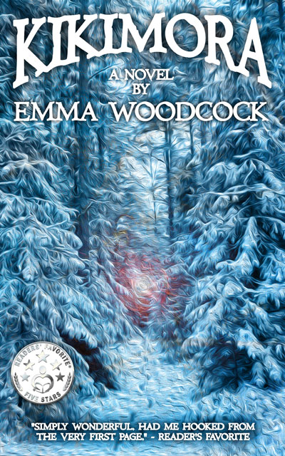


As already discussed, now that Darklands is selling in a proper bricks and mortar book shop, I realised I needed the spine to be a bit more assertive. After a suitable amount of deliberation, cogitation and digestion, my designer has ignored all my great ideas and redone the sky:

Darklands cover redesign by Uncut ID
I am absolutely thrilled! The changes were all fairly minor, but the overall effect is major.
We’ve also added all the additional stuff that I should have put on in the first place:
- Ace review quote on the front cover
- Author mugshot and short bio
- Blog, twitter and facebook info
- A colourful spine with interesting font
- A small image in the spine that might just catch people’s attention.
Compare that to the original full cover – we only supplied the front image for that one. I supplied the copy for the spine and back blurb, but it was added automatically, and with no custom design.

Darklands original full cover (ignore the dashed lines, they’re text placement guidelines)
I’ll need to proof a new copy of the paperback, so it will be a few weeks before the second edition is available to buy. I can’t wait. I think the difference is astonishing, and it looks a lot more professional.
I’d love to hear your thoughts. Do you like the new cover? Would you be more likely to buy it?

I think it looks good Emma- will definately stand out more in bookshops- by the way I keep meaning to say I think Scarthin might have sold out as I couldnt find a copy in the kids book room this week- though your poster is still up. See you soon. Alicex
Thanks, Alice. I asked the book shop, and aparently there are two copies left. They were ‘hidden behind another book’, so are now displayed more prominently!